REBRAND 2020
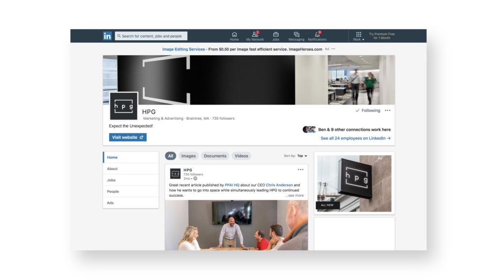
It started with a new name. Formerly, HUB Promotional Group, HPG is the parent company for some of the most recognizable supplier brand names within the Promotional Products industry, including ‘Hub’ the preeminent pen supplier. To diminish any market confusion, the name has been simiplified to the acronym. Reborn as ‘HPG’ it also needed a new identity that reflected the scale and dynamism of the collective. The design challenge was to create something distinctive yet flexible so it would stand out but not outshine the more recognizable brands.
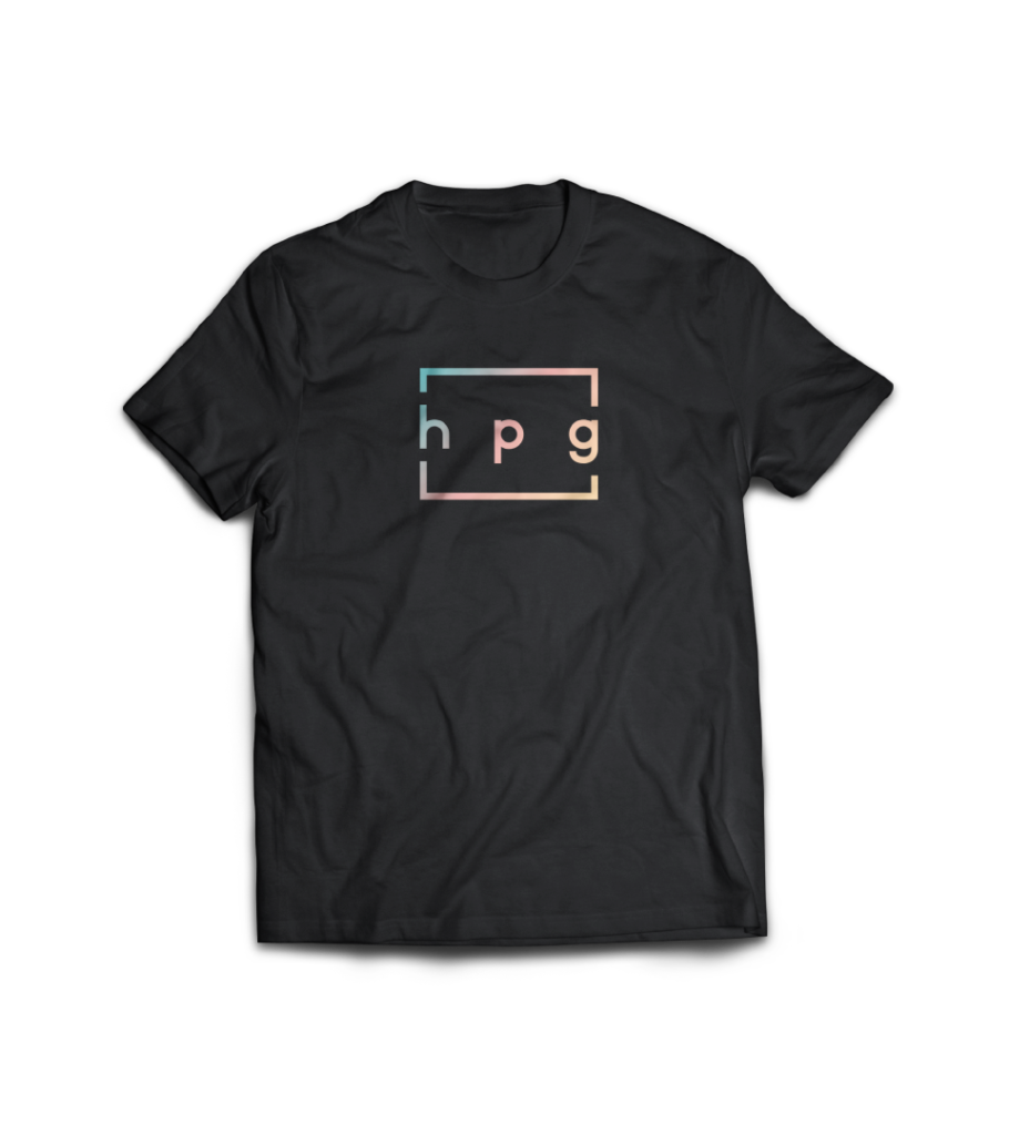
THE LOGO
The three letters are all very different shapes so designing a clean, simple looking form using those alone was ruled out early on. Using all-caps on an acronym created a monolythic look that does not reflect the approachable, friendly, customer-first brand values that the group has founded it’s success upon. The design team also wanted to introduce a graphic element that could be rolled out across many different applications and could stand alone without needing the full logo present.

THE BRACKETS
This graphic element can be used in many ways to wrap and highlight designs while calling back to the logo.
Highlight something!
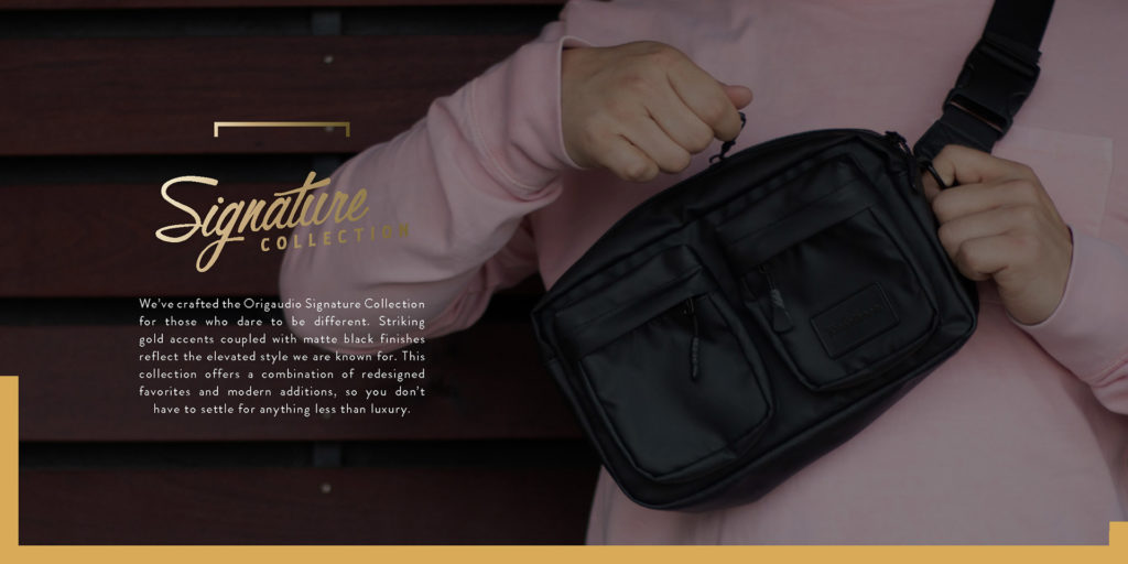
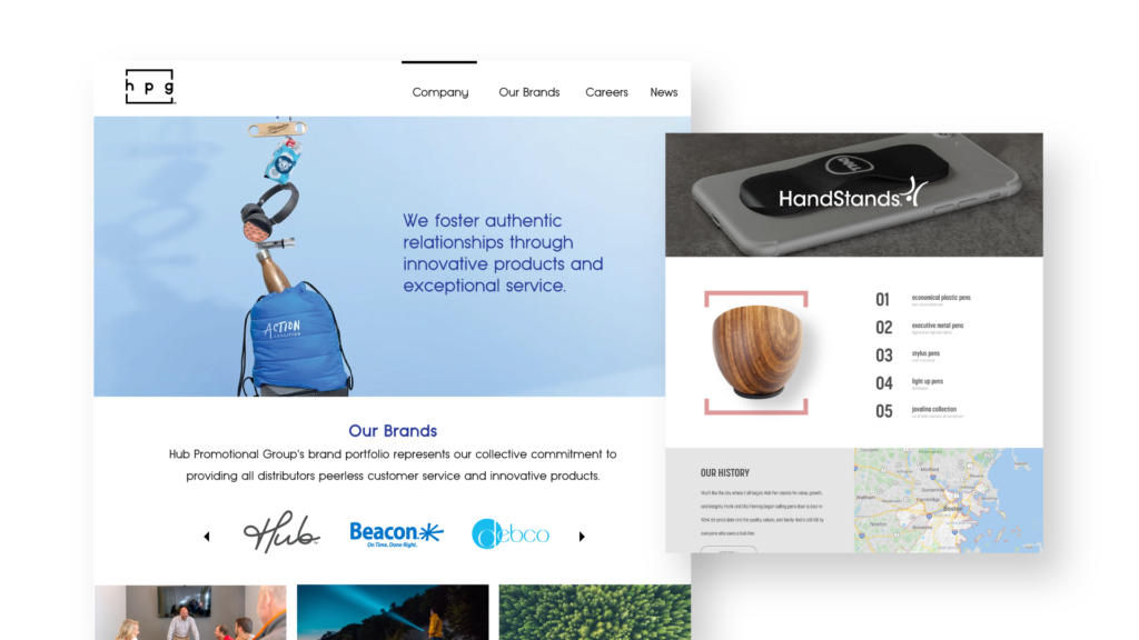
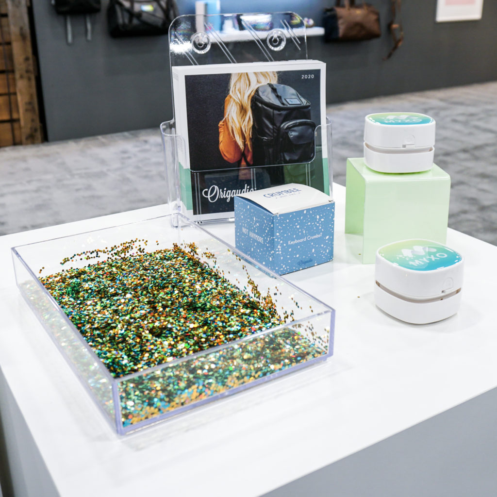
Brackets integrated into the Origaudio catalog
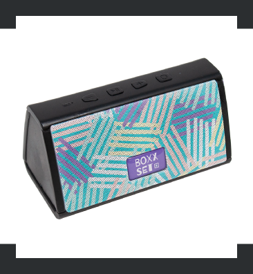
Brackets highlighting product
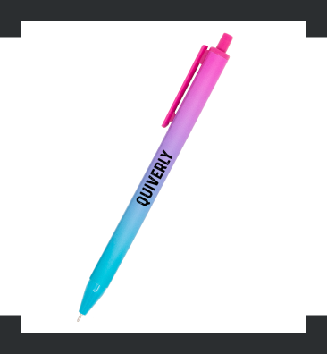
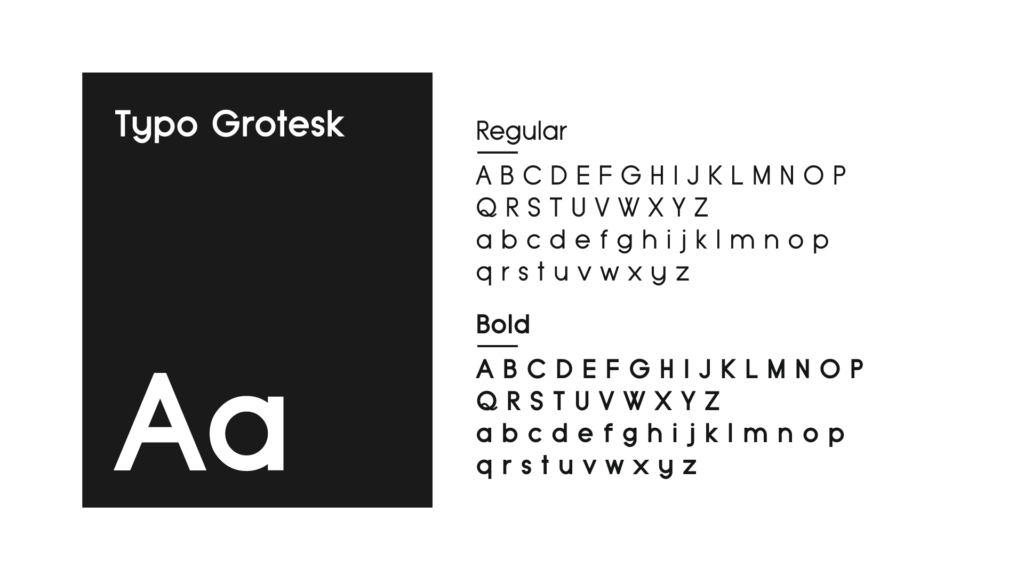
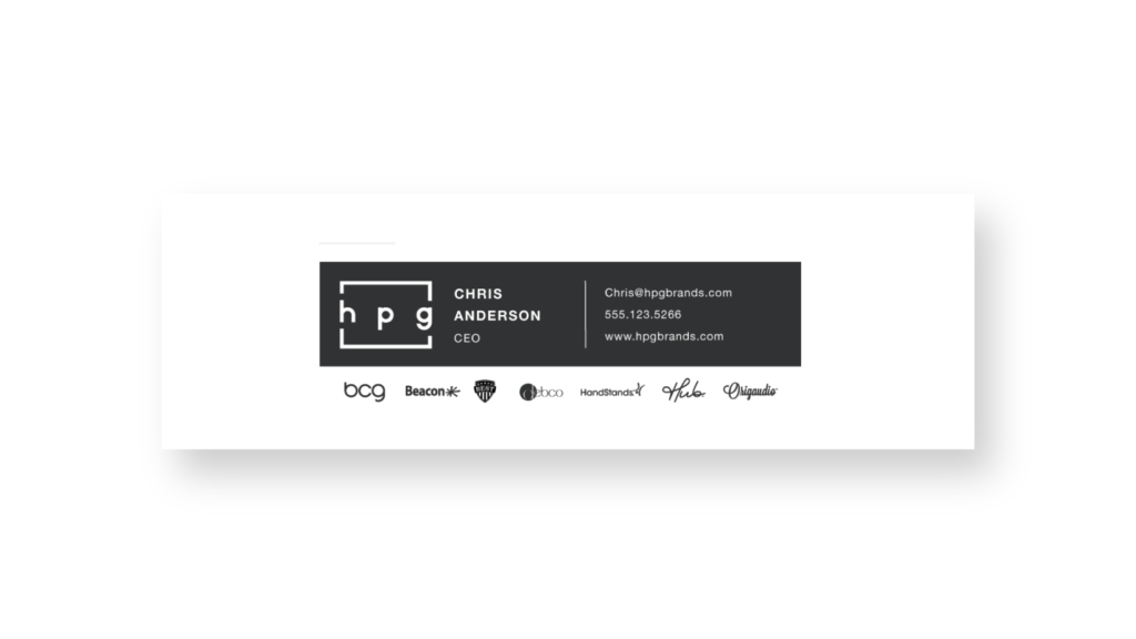
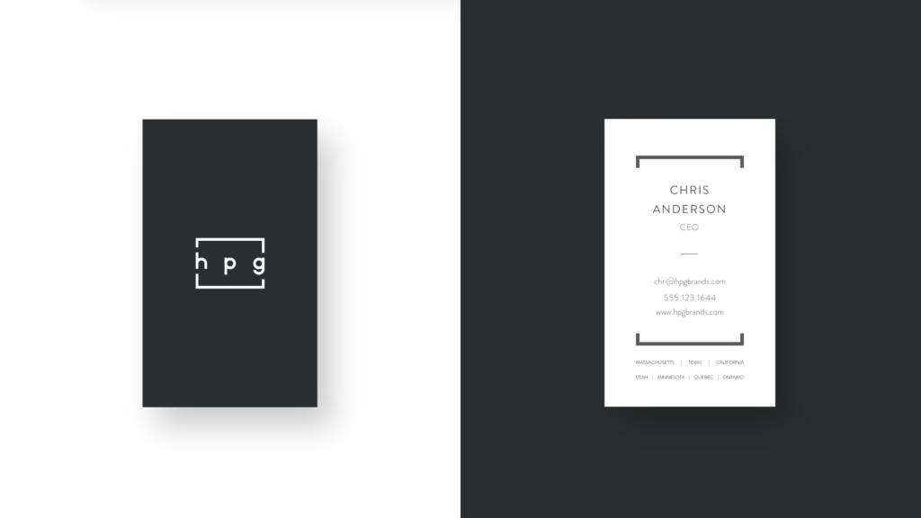
TYPOGRAPHY
The typeface design takes cues from that same schoolbook letter-printing style, but adopts the neutral consistency we’ve all come to expect from a geometric sans serif.
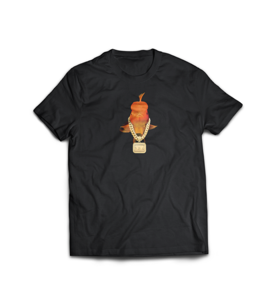
COLORS
A monochromatic scheme ensures the other brand colors will always stand out. Parent company artwork will always be at least 90% black & white but there are instances where a highlight color is needed such as a button in an email or subtitle on a document. In those case, “Plue” as it has been coined, acts as the secondary color. A vibrant, modern accent color that speaks to the bold creativity the parent company will be known for in the months and years to come.
90% Black
Hex: #1a1a1a
CMYK: 73, 67, 65, 78
RGB: 26, 26, 26
White
#ffffff
PMS 2736C
Hex: #2a3c98
CMYK: 99, 93, 0, 0
RGB: 42, 60, 152
DIGITAL
A real strength and differentiator for the group is the photography and design talent on staff. The neutral brand lets that come to the fore.
Heavy use of white space and fine details adds a sophisticated, premium look and feel to the brand that hints at the scale and status of the company.
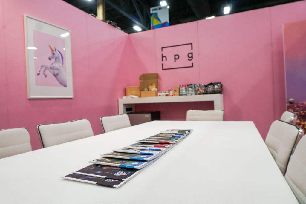
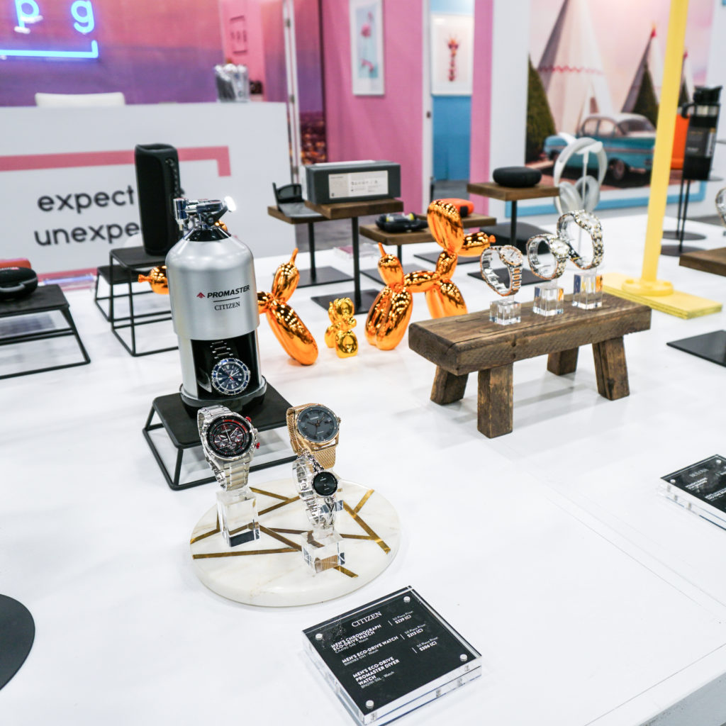
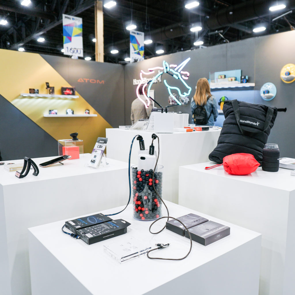
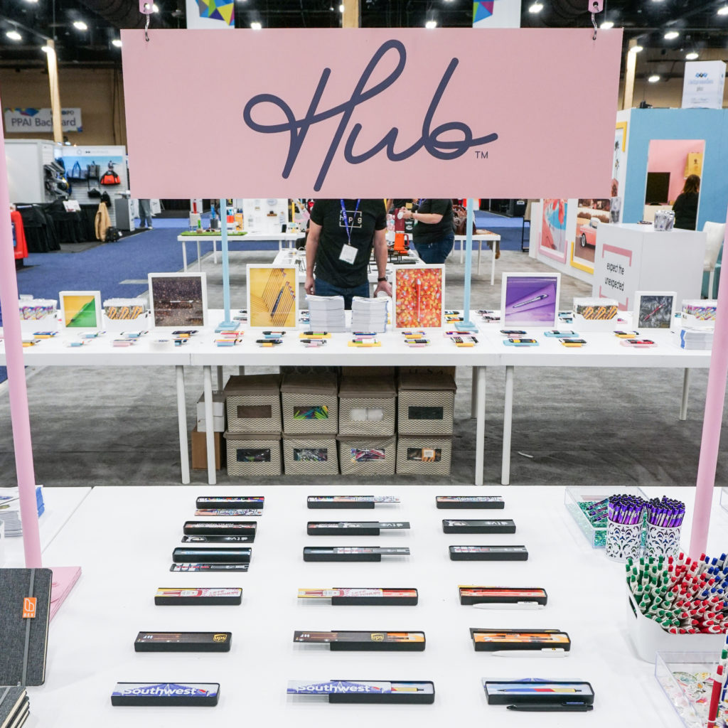
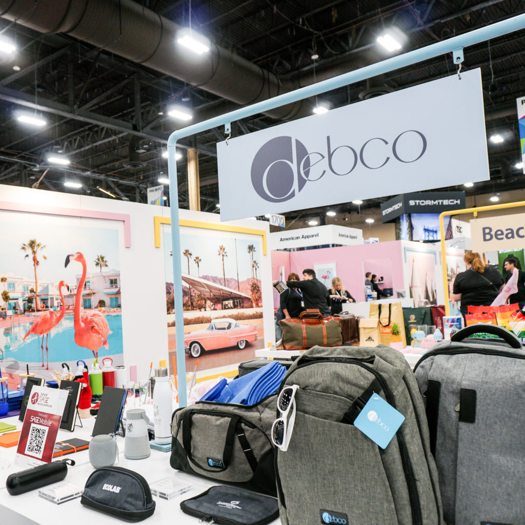
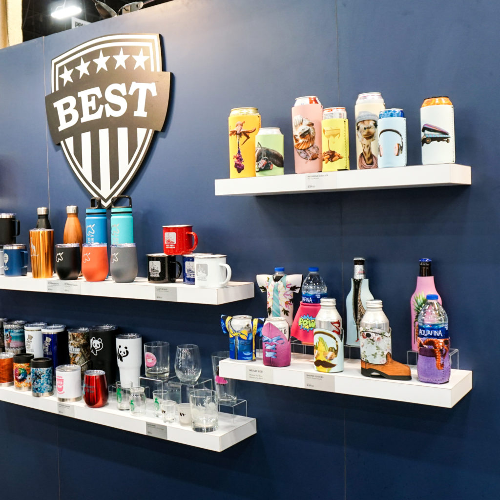
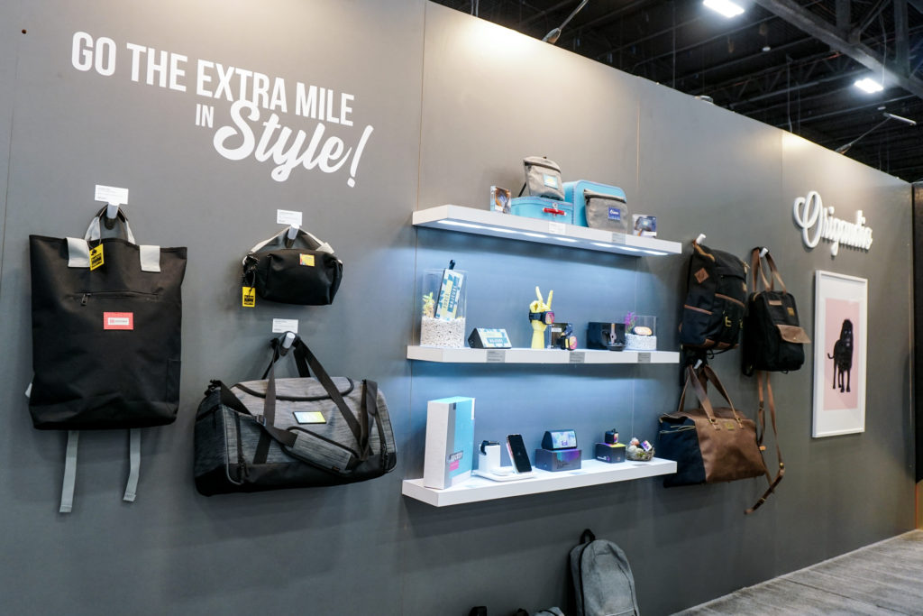
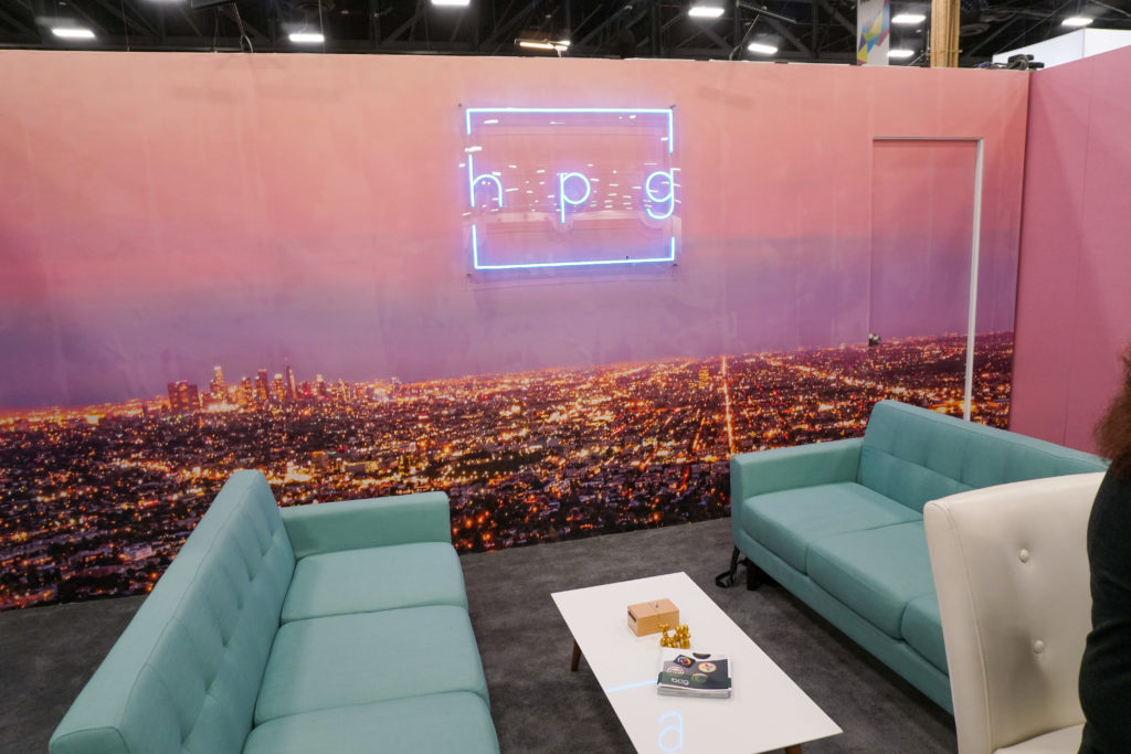
EXPERIENCE
HPG’s approach is to design something enticing because word-of-mouth at events is our best marketing tool. Once the crowd is drawn in, the goal is make the space something explorable, fun, delightful so potential customers want to stay with us and get to know us.
Want the latest on HPG?
Receive the HPG newsletter delivered to your inbox.